Configurable Filter
During my summer internship in 2022, I was the sole designer on the PLM Connect team, where I designed and delivered a new search and filter experience that helped users find items more easily and efficiently.
Challenge
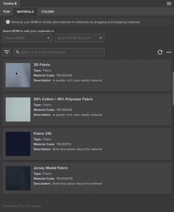
The previous search experience was time-consuming and cumbersome. Filters were hard-coded, couldn’t adapt to evolving user needs, and required users to switch between pages to apply changes.
Solution
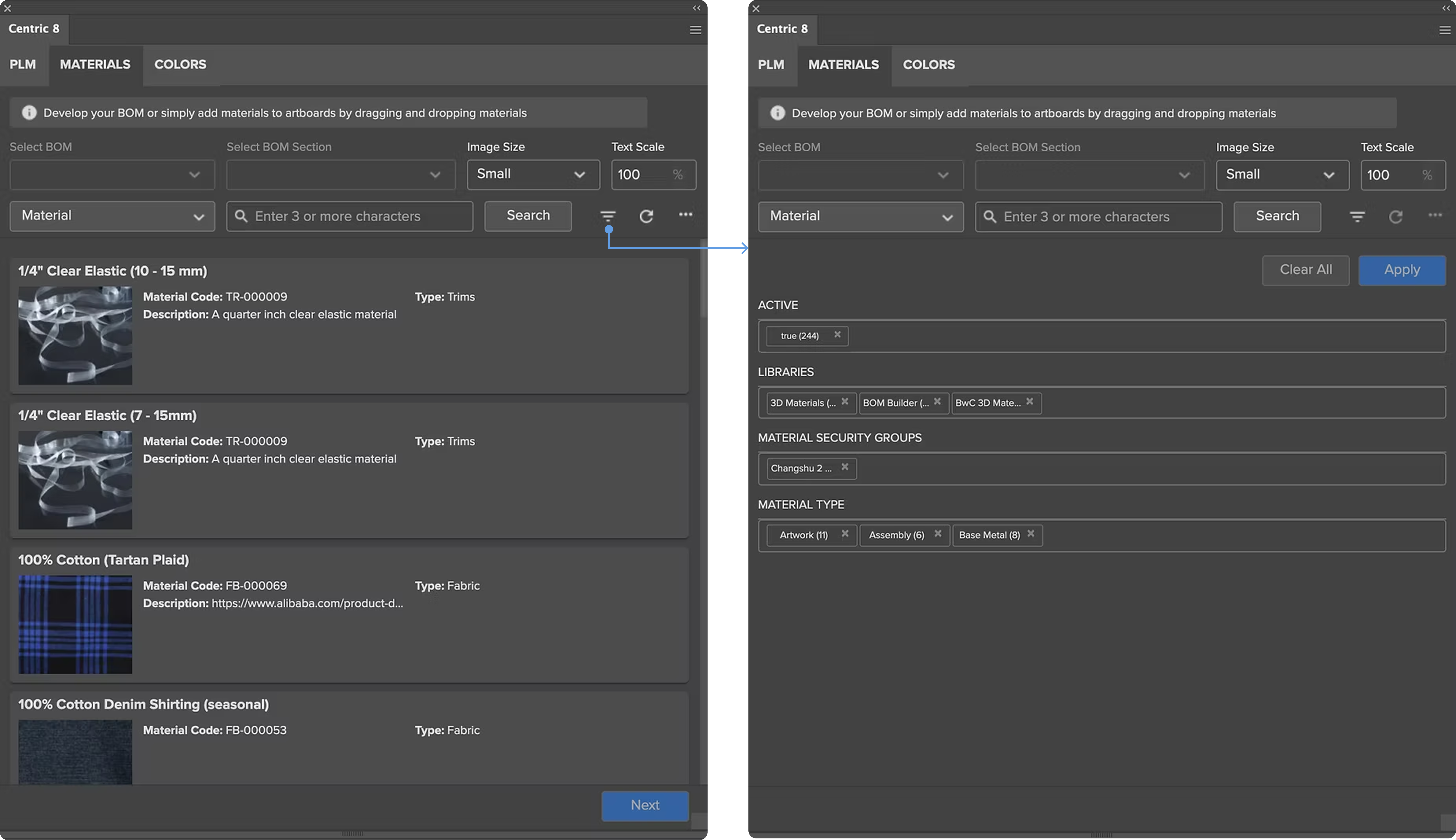
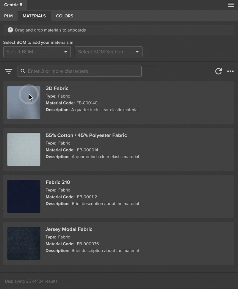
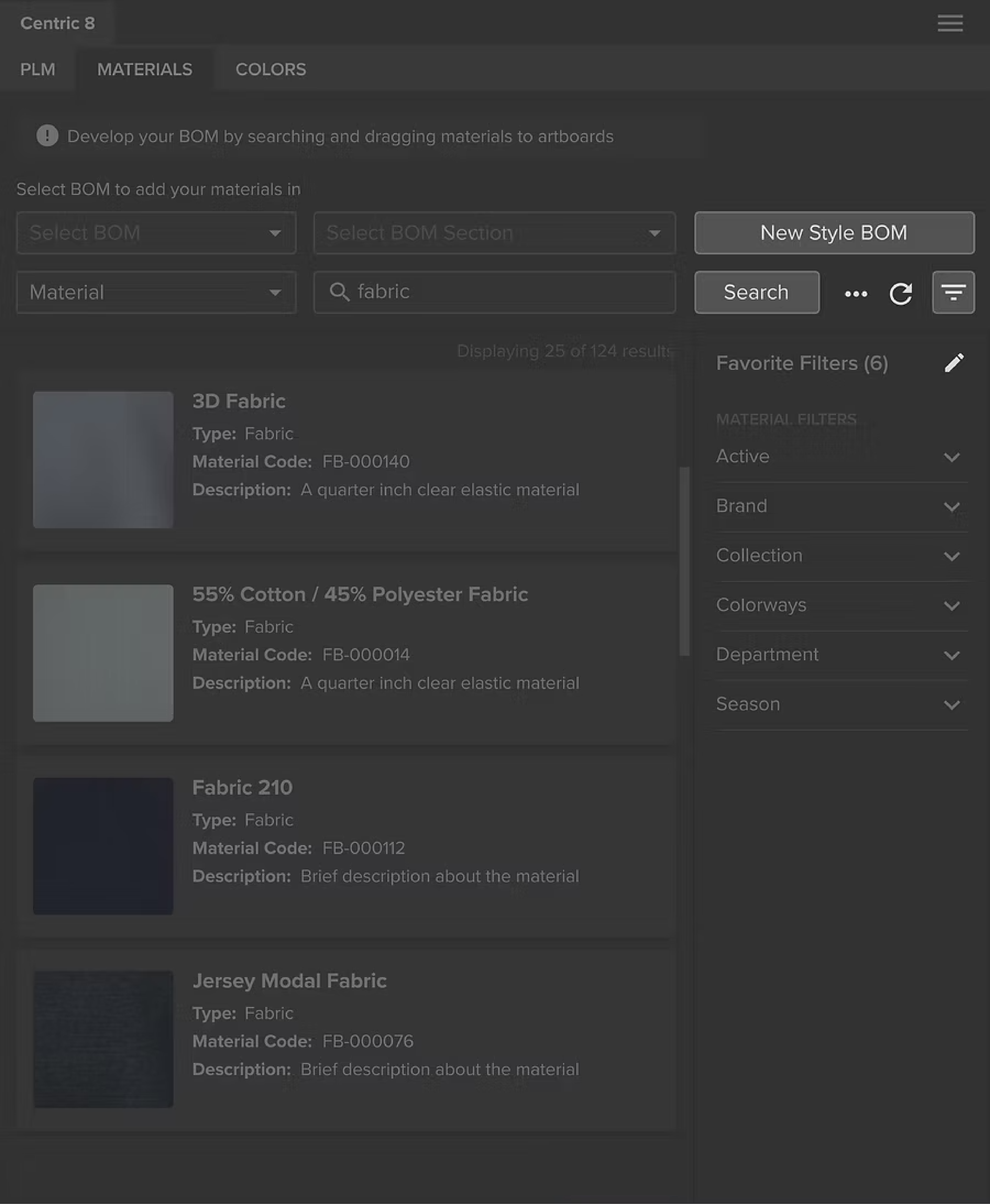
The redesigned search experience makes it easier for users to find what they need with an intuitive filter panel.
Designed with configurability in mind, the solution allows users to surface only the filters they need.
This keeps the experience fast, focused, and scalable over time.
Outcome
The new search solution was reused across all PLM connectors, impacting 300+ customers and improving search efficiency by 65%.
Design Process Highlights
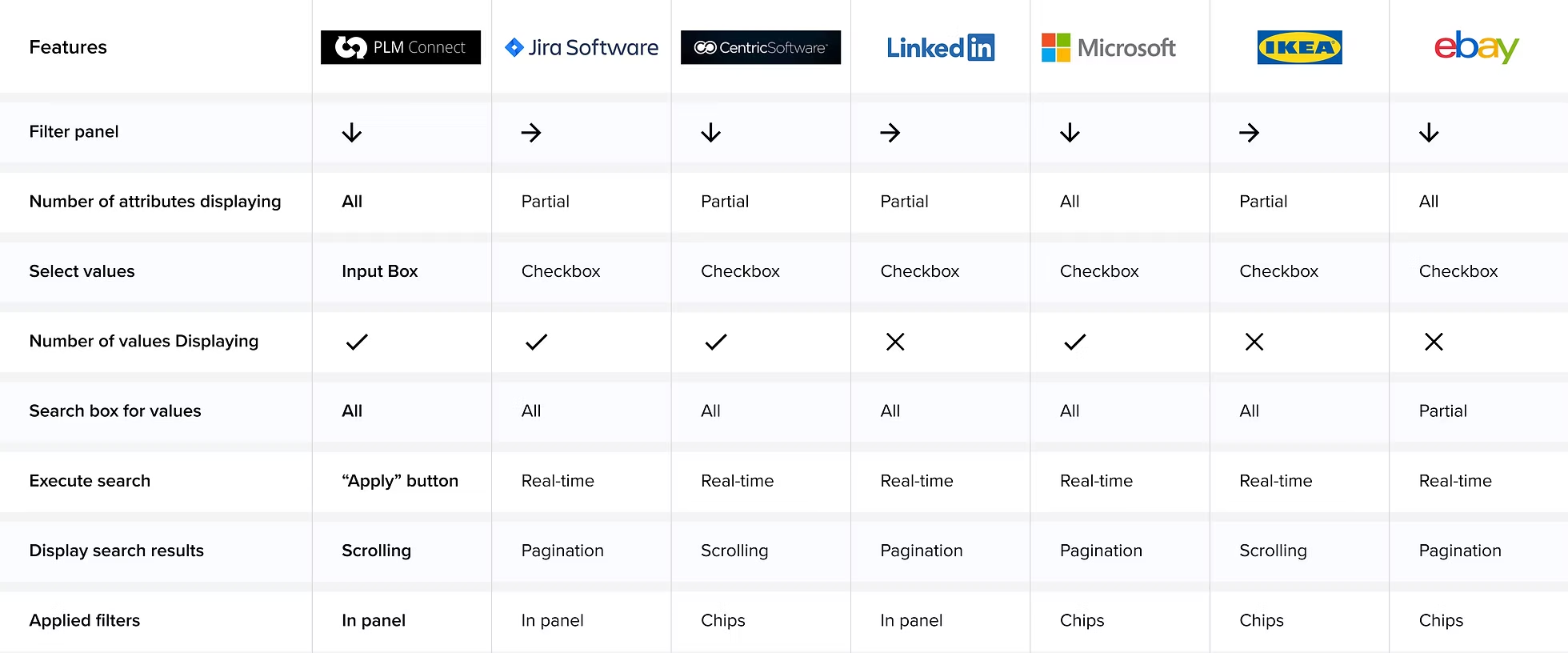
Competitive Analysis
I compared the connector with other products and identified two key differences:
- Most products use checkboxes for value selection, while PLMC relies on input fields.
- Most support real-time filtering, whereas PLMC requires an explicit “Apply” action.
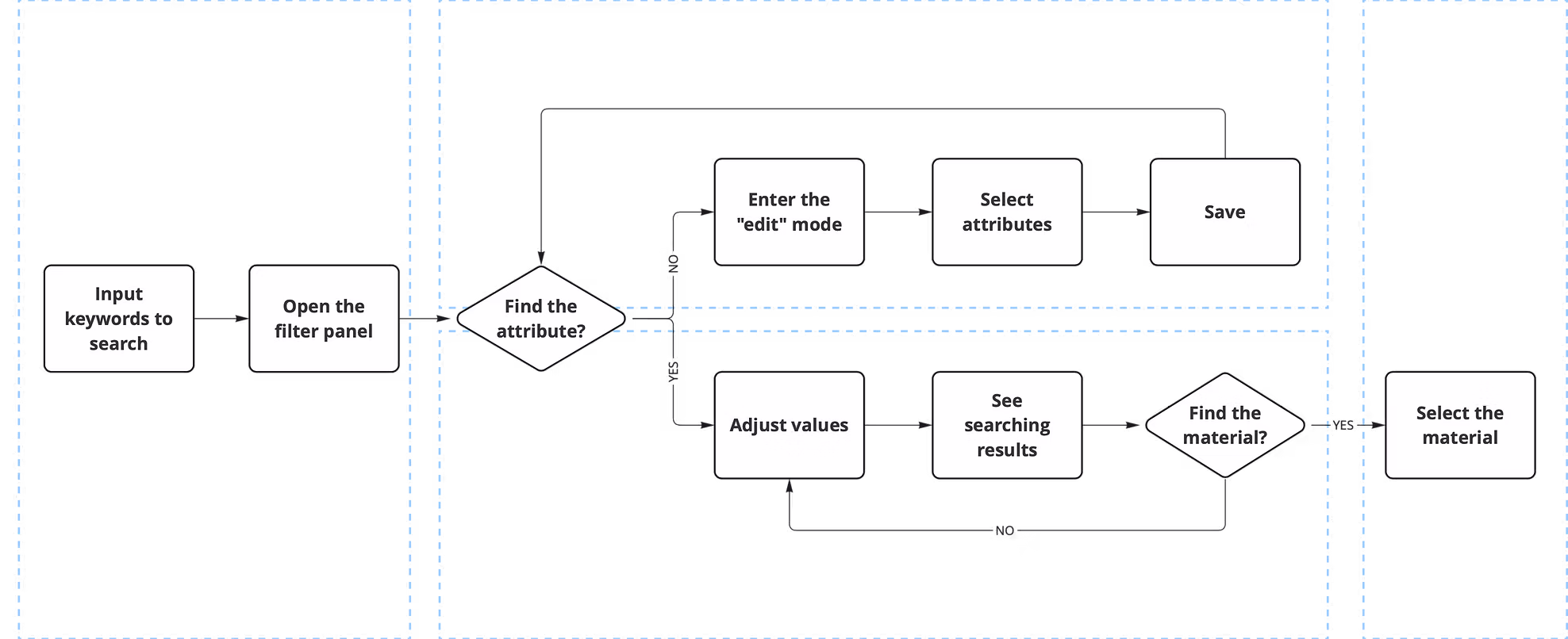
User Flow
The main goal of this project is configurability. With hundreds of attributes in the system and varying user needs, I integrated filter configuration directly into the user workflow.
Design Explorations
Design Challenge 1 - Integrate the filter panel to the current window
V1: Horizontal Bar
Not scalable and the pop-up window hides the search results.
V2: Vertical Bar ✅
More scalable and does not interfere with search results.
Design Challenge 2 - Support users to configure the filter panel
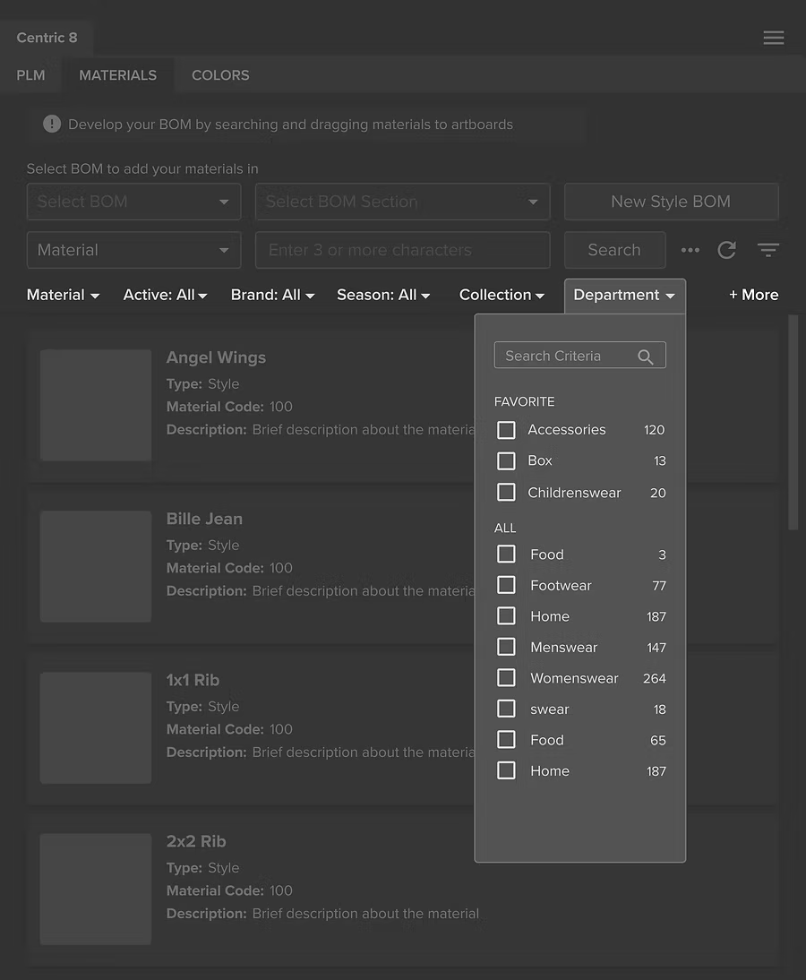
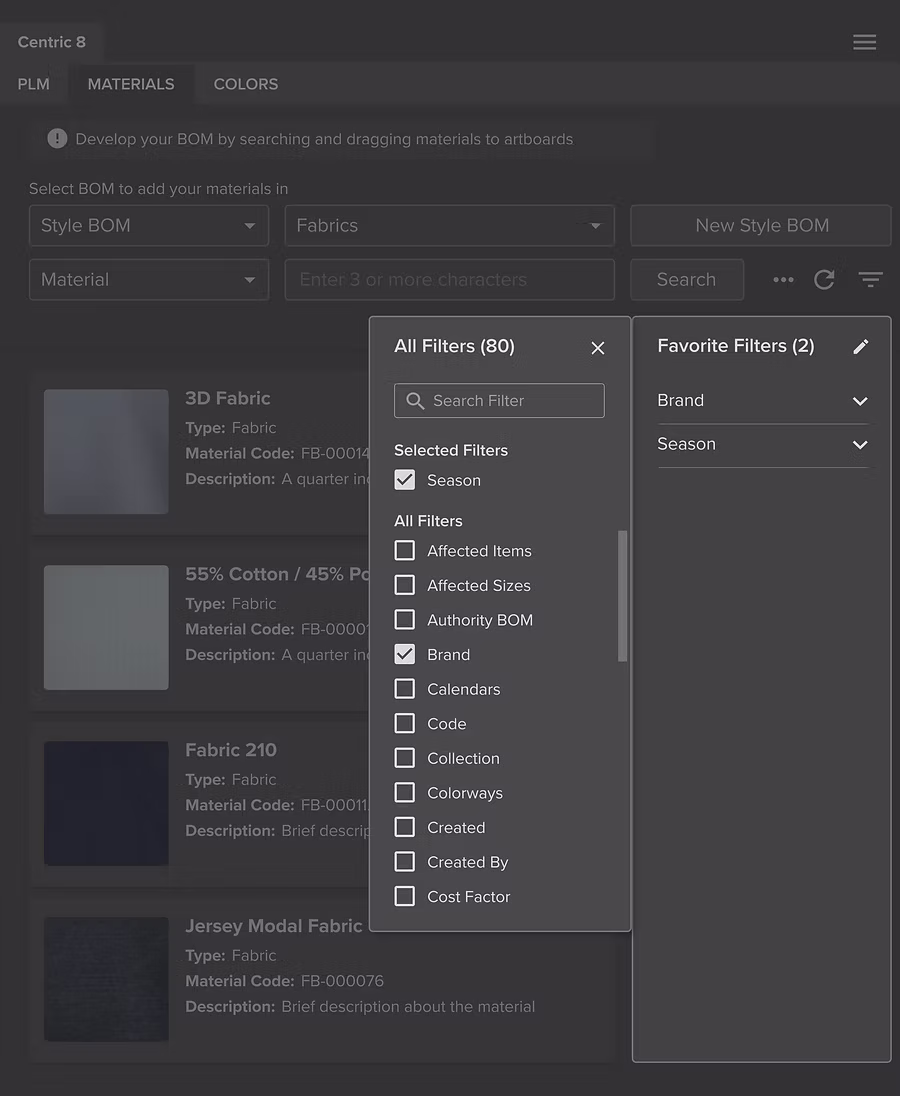
V1: Pin Favorite Filters
Business consultants shared a common user quote: “Don’t show me the stuff I don’t care about.”
Users tend to search in consistent ways, so there’s no need to display all filter attributes all the time.
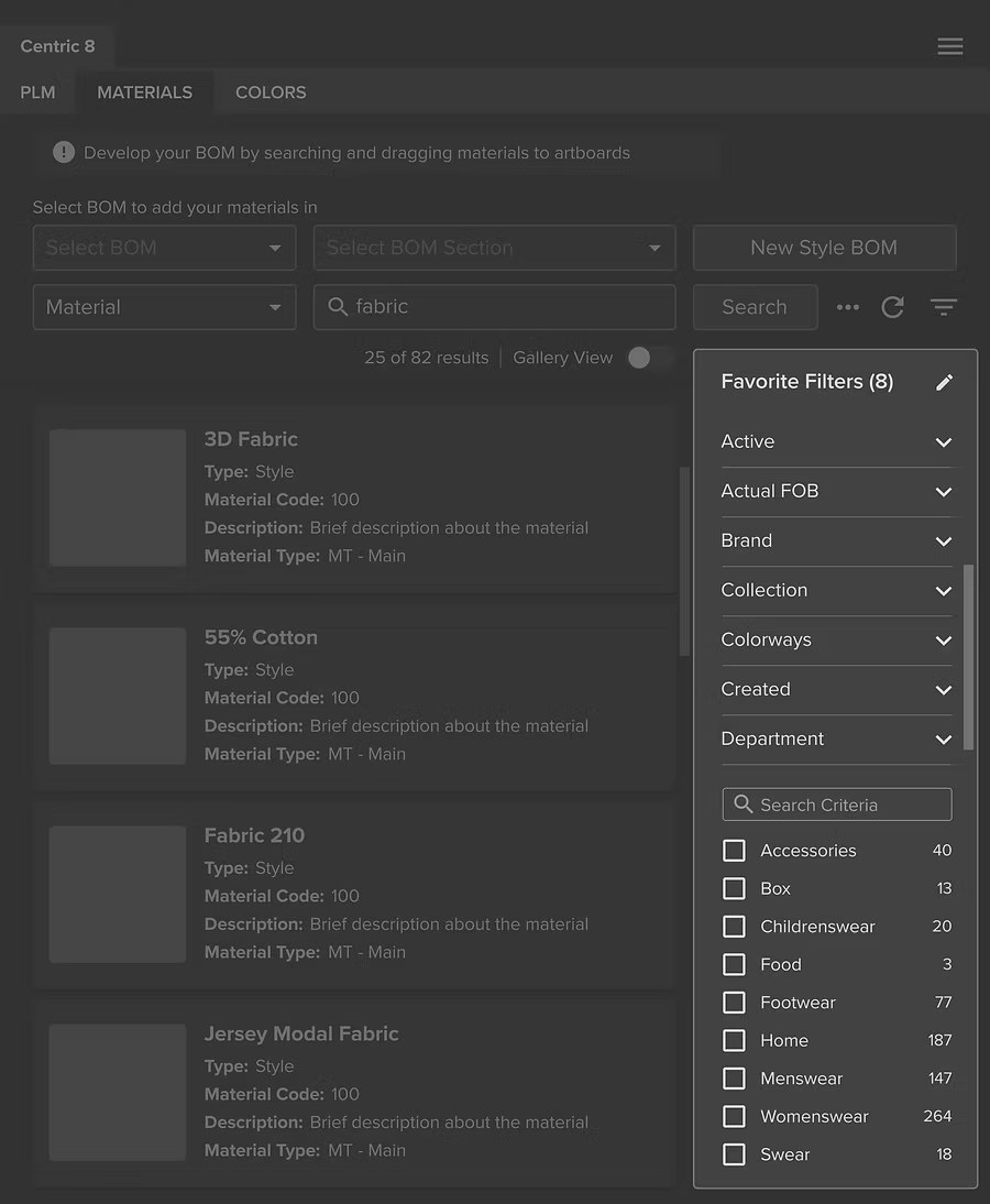
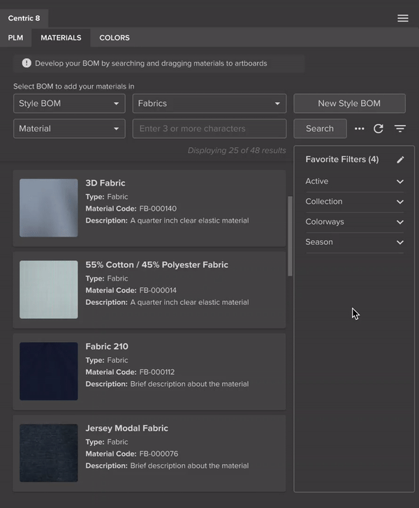
V2: View Favorite Filters Only ✅
Users only see the favorite filters based on selection. This reduces the visual noise and helps them focus on the key filters they use most.
Test and Iterate
Using high-fidelity prototypes, I conducted a one-week usability study with 12 customers and internal stakeholders. The overall feedback was very positive with high satisfaction scores, while also revealing areas for further improvement.
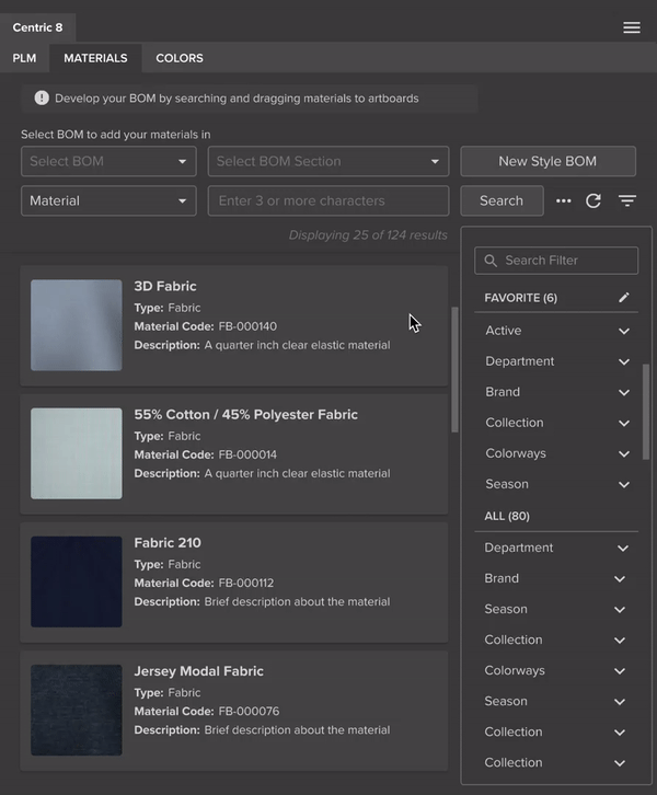
Before: Users feel distracted when configuring filters
Users have to pay attention to changes on both panels at the same time, which causes confusion.
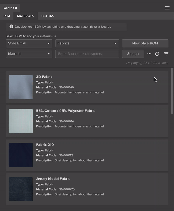
After: A single, focused panel
The panel switches to a configurable state when clicking the edit icon, allowing users to focus on one place at a time.
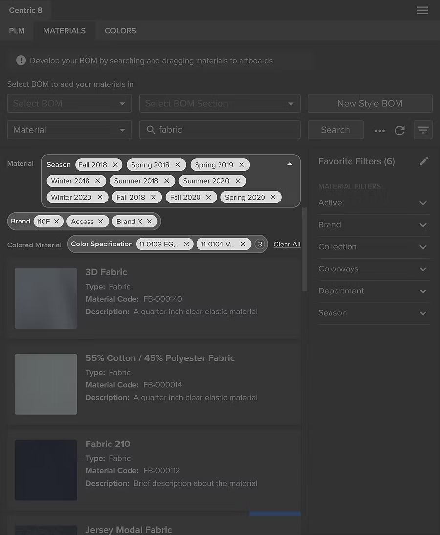
Before: Chips display aren't scalable
The interface can quickly become overwhelmed when multiple values are selected.
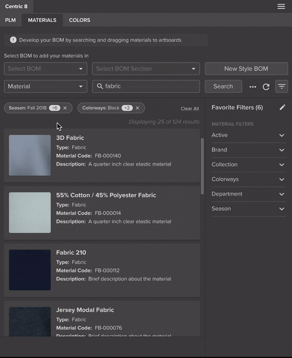
After: Collapsed chip
Chips are grouped by attribute type, reducing visual clutter while preserving quick access.
Before: Cluttered elements
Too many action buttons result in cognitive load.
After: Simplified interface
The new layout alignis with users’ natural left-to-right reading flow.
